


Table Of Contents
The colours used inside a retirement home or aged care facility do far more than decorate a space. They directly influence how residents feel, how well they sleep, how easily they navigate their environment, and even how safe they feel day to day. For facilities managers and operators, thoughtful colour selection is one of the most impactful design decisions you can make.
Why Colour Matters in Aged Care Environments
Research into colour psychology consistently shows that the built environment affects emotional and cognitive wellbeing. For seniors, particularly those living with dementia or cognitive decline, colour plays an even more critical role.
The right colour choices can:
- Reduce anxiety and promote a calm, settled atmosphere
- Support wayfinding and help residents navigate spaces independently
- Stimulate social interaction in communal areas
- Improve sleep quality through restful tones in private spaces
- Reduce confusion and disorientation for residents with memory impairment
Picking Colours for Retirement Homes
Selecting the right colours for retirement homes goes beyond personal preference; it's about creating an environment that nurtures well-being and comfort. Here's a guide to help you navigate the palette and make thoughtful choices for a vibrant and soothing living space.

Consider the residents
Start by understanding the unique needs and colour preferences of the residents. Are there specific cultural backgrounds or personal preferences that should be considered? Engage with the senior living community to gather insights, ensuring that the chosen colours resonate with those who call the retirement home their haven.
Embrace calming tones
Opt for calming tones like soft blues, greens, and muted pastels in communal areas and bedrooms. These colours have a soothing effect and contribute to a relaxed atmosphere, promoting a sense of tranquillity essential for seniors' well-being.
Balance warm and cool tones
Create a harmonious blend between warm and cool tones to cater to various preferences. Earthy tones like warm browns and subtle oranges can add warmth to communal spaces, while cool tones in private areas maintain a serene ambience. Striking this balance ensures that the overall environment is inviting and inclusive.
Mindful use of patterns
Incorporate patterns thoughtfully, especially in areas where seniors spend significant time. Subtle and non-distracting patterns can add visual interest without overwhelming the space. Consider patterns that evoke a sense of familiarity, providing comfort without creating visual confusion.
Natural light enhancement
Maximise the impact of natural light by choosing colours that complement sunlight. Lighter shades can amplify the brightness in a room, creating an uplifting atmosphere. Ensure that window treatments allow for flexibility in adjusting the amount of light entering the space, giving residents control over their environment.
Dementia-friendly colours
For areas where residents may be dealing with dementia, opt for dementia-friendly colours. Soft colour contrasts and pastel hues can assist with navigation and reduce confusion, aiding memory care. Consider incorporating colour-coded elements to help individuals easily identify different areas within the retirement home.
Personalisation with neutrals
Use neutral tones as a base for larger areas and furnishings, allowing for easy personalisation. This neutrality provides a versatile backdrop that can be enhanced with pops of colour through artwork, accessories, or residents' personal items, adding a customised touch to individual spaces.
Regular evaluation and adaptation
Colours that are suitable today may need adjustments tomorrow. Regularly evaluate the impact of the chosen colour scheme and be open to adaptations based on resident feedback and changing needs. A dynamic approach ensures that the retirement home remains a vibrant and supportive environment over time.
Seek professional guidance
Consider consulting with professionals specialising in senior living design and colour psychology. Design experts can provide valuable insights into creating an environment that enhances the well-being of residents. Their expertise ensures that the chosen colours align with aesthetic preferences and senior living spaces' unique requirements.
Test samples in different lighting
Before finalising colour choices, test samples in various lighting conditions. Colours can appear different under natural and artificial light, and it's essential to ensure that the chosen palette maintains its desired effect throughout the day. This step helps in avoiding surprises and ensures that the colours remain consistent.
The Impact of Colour Palettes on Senior Homes
Choosing a colour palette for senior homes is a delicate art that goes beyond mere aesthetics; it's about creating an environment that nurtures well-being and enhances the quality of life. Let's explore how different colour palettes can have distinct effects on seniors, contributing to their physical, emotional, and mental health.

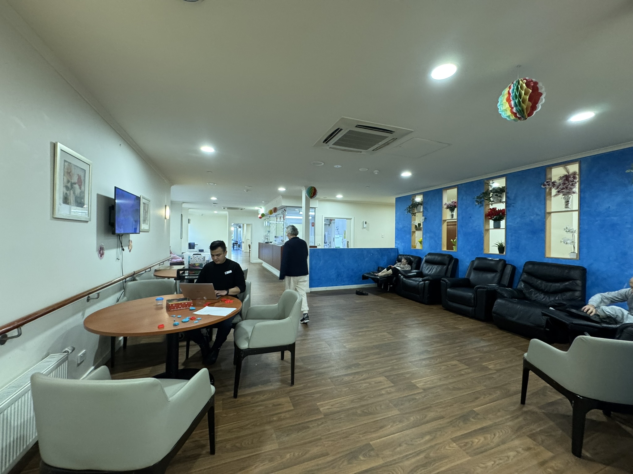
Cool serenity: Blues and greens
These calming tones promote relaxation and reduce anxiety. Blues and greens have a therapeutic effect, creating a serene atmosphere that echoes the tranquillity of nature. In bedrooms and communal spaces, these hues contribute to restful environments, fostering a sense of peace essential for a good night's sleep.
Warm invigoration: Yellows and oranges
Warm tones like yellows and oranges inject vibrancy into communal areas, encouraging social interaction and creating a lively atmosphere. These hues evoke feelings of warmth and energy, making them ideal for spaces where residents gather for activities and shared moments.
Earthy elegance: Browns and soft neutrals
Earthy tones offer a sense of elegance and stability. Browns and soft neutrals provide a warm backdrop, creating a cosy and inviting environment. These colours are well-suited for furnishings and common areas, adding a touch of sophistication while maintaining a comfortable and homey feel.
Pastel comfort: Muted hues
Muted pastels contribute to a gentle and comforting ambience. Soft pinks, lavender, and light blues are particularly effective in bedrooms, providing a soothing environment that promotes relaxation. These colours are ideal for creating personalised and serene spaces for residents.
Contrasting elements: Accent colours
Introducing an accent colour adds visual interest and can be strategically used to highlight specific areas or elements. Bold yet carefully chosen accents stimulate visual engagement without overwhelming the senses. Consider incorporating accent colours in artwork, decor, or furnishings to create focal points within the senior home.
Nature's embrace: Greens and browns
Bringing elements of nature into the colour palette creates a connection with the outdoors. Greens and browns mimic the hues of nature, providing a sense of familiarity and tranquillity. These colours are particularly effective in spaces with ample natural light, creating a seamless blend between indoor and outdoor environments.
Harmonious contrasts: Balance and cohesion
Striking a balance between contrasting colours ensures a harmonious overall effect. Cohesion in the colour palette creates a sense of order and unity within the nursing home. Carefully consider the placement and intensity of contrasting elements to maintain a visually pleasing and comfortable living environment.
Professional Aged Care Painting in Melbourne
At Avello Group, we work with aged care operators and facilities managers across Melbourne to deliver painting programmes that are safe, minimally disruptive, and tailored to the unique needs of senior living environments. From colour selection guidance to professional application using low-VOC, resident-safe products, our team understands the care this work requires.
So, as you embark on the journey of creating a haven for seniors, remember that the canvas is vast, and the colours are limitless. Let's continue to paint a vibrant picture of ageing, where every stroke represents the warmth and care our elders genuinely deserve.
For a free consultation or property paint condition report, get in touch with us today.


.jpg)